Sveltekit-naaraan
This tutorial will help you understand about:
- naaraan: a mono repository using pnpm workspace that holds all frontend services in API PLUS TECH.
- FoundationAPI: API PLUS TECH internal GraphQL API to mutate and query data from a database. You can read more about GraphQL for Front End Developers here)
- Tilt: a toolkit for microservice development. You can read more about Tilt here.
What we're going to build
We are going to create 2 new pages in the storefront admin
-
Product list page: a page to display a list of the first 50 products with SSR in /admin/products route.
-
Product CRUD page: a page to create, display product details (SSR), update, and delete following these conditions:
- if the URL is /admin/products/new (product_id = "new"), this page can only create a product.
- if the URL is /admin/products/[product_id], this page can read, update and delete a product.
with these features:
- Theme switching: change between light and dark theme
- Language switching: change between EN and TH
- Responsive with desktop, tablet and mobile layouts
by following these the Figma design
You can get a github starter project here.
Project structure
.
├── config.yaml  ---> config file for transtaltion generator
├── Makefile     ---> make file for run the transtaltion generator commands
├── apps
│    ├── account ---> authentication and business-unit management website
│    ├── hq      ---> landing page website for naaraanhq
│    └── storefront ---> e-commerce and admin website
├── docker ---> all project dockerfile
├── packages
│    └── shared ---> shared code between apps
│        ├── assets ---> static assets ex. fonts
│        ├── components ---> shared components
│        ├── configs ---> config files ex. tailwind.config.cjs
│        ├── constants ---> all constants
│        ├── data
│        │   ├── functions ---> store all api functions
│        │   ├── models  ---> store all api types
│        │   └── sources ---> store all api clients
│        ├── helpers
│        ├── stores ---> global svelte stores ex.env, theme
│        ├── styles ---> global styles ex. app.postcss
│        ├── translations ---> all constants
│        │   ├── i18n.ts ---> translation configs
│        │   ├── app ---> all translation for all apps
│        │   │   ├── app_keys.csv  ---> translation key value of all languages for app
│        │   │   ├── config.yaml  ---> translation configs for app
│        │   │   └── langs ---> generated json from csv
│        │   ├── error  ---> all translation for all errors
│        │   └── generated ---> generated translation enum
│        └── utils
└── tilt ---> configs and script for developing microservices
Project setup
-
Setup the Github pre-commit to format code before commit
make setup -
Install project dependencies from this command
pnpm i -
Install the gql-python to autogenerate GraphQL function types
pip install gql[all]Note: for mac please use this command instead
pip install gql\[all\]
Start all microservices with Tilt
-
Go to the
tiltfoldercd tilt -
Run Docker login as Apiplus-bot to pull backend services image from the Github private container registry.
echo <token-from-apiplus-bot> | docker login ghcr.io -u apiplus-bot --password-stdin -
Run setup script
make setup -
Start all microservices
make up -
Go to http://localhost:10350 to check that all services are ready
These are all service URLs:
Back-end:
   - FOUNDATION_PUBLIC_URL = <https://foundation.naaraanhq.dev/query>
   - FOUNDATION_ADMIN_URL = <https://foundation-admin.naaraanhq.dev/query>
   - REST_FOUNDATION_PUBLIC_URL = <https://foundation.naaraanhq.dev>
   - KRATOS_PUBLIC_URL = <https://kratos.naaraanhq.dev>
   - HYDRA_PUBLIC_URL = <https://hydra.naaraanhq.dev>
   - AUTHEN_PUBLIC_URL = <https://authen.naaraanhq.dev/graphql>
Front-end:
   - Hq = <https://www.naaraanhq.dev>
   - Account = <https://account.naaraanhq.dev>
   - Storefront = https://**business-unit-name**.naaraan.dev
Create NAARAAN account
-
Click the
Sign upbutton to go to /sign_up route. -
Enter test user information and press the
Sign upbuttonEmail: test@test.com
Password: Secured112233445
Create Business-Unit
-
Click
Create new business -
Enter business unit information
Store Name: test -
After clicking
Confirm, the website will redirect to https://test.naaraan.dev/admin
Add typography
-
Open this Figma Design system for typography and color scheme.
-
Look at
fontSizefield insidethemefield intailwind.config.cjs.fontSize: {
h0: ['4rem', '6rem'],
h1: ['2.25rem', '3.375rem'],
h2: ['1.5rem', '2.25rem'],
h3: ['1.25rem', '1.875rem'],
label: ['1rem', '1.5rem'],
body: ['0.875rem', '1.25rem'],
caption: ['0.75rem', '1rem']
},
Add theme switching
-
Open this Figma Design system for typography and color scheme.
-
Add a CSS variable of light and dark theme colors from the color scheme to
packages/shared/src/lib/styles/app.postcss..theme-light {
--primary: #435bc2;
--primaryVariant: #3542b7;
--primaryOpacity: #435bc21a;
--primaryOpacityFlatten: #eceff9;
--primaryOpacity2: #e2eafc;
--secondary: #ffffff;
--secondaryVariant: #f3f3f3;
--secondaryOpacity: #3231300d;
--background: #ffffff;
--backgroundHq: #181755;
--backgroundVariant: #f0f1f6;
--error: #fd706b;
--errorOpacity: #b80f0a1a;
--success: #57c954;
--successOpacity: #48bf5340;
--disable: #f6f6f6;
--disableOpacity: #dddddd40;
--disableOpacityFlatten: #f7f7f7;
--inProgress: #ffb800;
--inProgressOpacity: #ffb80040;
--textNormal: #202223;
--textDisable: #bbbbbc;
--textHint: #8594a6;
--textAccent: #3d51bb;
--textWarning: #f0635e;
--textOnSurface: #ffffff;
--stroke: #e0e0e0;
--lightStroke: #ececec;
--modalBackground: #c4c4c473;
--promptPayBackground: #00427a;
--gray: #eaeaea;
--black: #000000;
--nightBackground: #2f3135;
--navIcon: #949eb4;
}
.theme-dark {
--primary: #6893ef;
--primaryVariant: #658ee7;
--primaryOpacity: #435bc21a;
--primaryOpacityFlatten: #eceff9;
--primaryOpacity2: #e2eafc;
--secondary: #ffffff;
--secondaryVariant: #f3f3f3;
--secondaryOpacity: #3231300d;
--background: #2f3135;
--backgroundHq: #181755;
--backgroundVariant: #f0f1f6;
--error: #fd706b;
--errorOpacity: #b80f0a1a;
--success: #57c954;
--successOpacity: #48bf5340;
--disable: #f6f6f6;
--disableOpacity: #dddddd40;
--disableOpacityFlatten: #f7f7f7;
--inProgress: #ffb800;
--inProgressOpacity: #ffb80040;
--textNormal: #ffffff;
--textDisable: #bbbbbc;
--textHint: #8594a6;
--textAccent: #3d51bb;
--textWarning: #f0635e;
--textOnSurface: #ffffff;
--stroke: #e0e0e0;
--lightStroke: #ececec;
--modalBackground: #c4c4c473;
--promptPayBackground: #00427a;
--gray: #eaeaea;
--black: #000000;
--nightBackground: #2f3135;
--navIcon: #949eb4;
} -
Look at custom colors inside
themefield inpackages/shared/src/lib/configs/tailwind.config.cjs.colors: {
current: 'currentColor',
primary: 'var(--primary)',
primaryVariant: 'var(--primaryVariant)',
primaryOpacity: 'var(--primaryOpacity)',
primaryOpacityFlatten: 'var(--primaryOpacityFlatten)',
primaryOpacity2: 'var(--primaryOpacity2)',
secondary: 'var(--secondary)',
secondaryVariant: 'var(--secondaryVariant)',
secondaryOpacity: 'var(--secondaryOpacity)',
background: 'var(--background)',
backgroundHq: 'var(--backgroundHq)',
backgroundVariant: 'var(--backgroundVariant)',
error: 'var(--error)',
errorOpacity: 'var(--errorOpacity)',
success: 'var(--success)',
successOpacity: 'var(--successOpacity)',
disable: 'var(--disable)',
disableOpacity: 'var(--disableOpacity)',
disableOpacityFlatten: 'var(--disableOpacityFlatten)',
inProgress: 'var(--inProgress)',
inProgressOpacity: 'var(--inProgressOpacity)',
textNormal: 'var(--textNormal)',
textDisable: 'var(--textDisable)',
textHint: 'var(--textHint)',
textAccent: 'var(--textAccent)',
textWarning: 'var(--textWarning)',
textOnSurface: 'var(--textOnSurface)',
stroke: 'var(--stroke)',
lightStroke: 'var(--lightStroke)',
modalBackground: 'var(--modalBackground)',
promptPayBackground: 'var(--promptPayBackground)',
gray: 'var(--gray)',
black: 'var(--black)',
nightBackground: 'var(--nightBackground)',
navIcon: 'var(--navIcon)'
}, -
Create
theme.tsinsidepackage/shared/src/lib/storesfor switching between light theme and dark theme.import { writable } from 'svelte/store'
export const isDarkMode = writable<boolean>(false) -
You can implement theme switching by adding theme-dark and theme-light CSS variables to
+layout.svelte<script lang="ts">
import { isDarkMode } from '$shared_lib/stores/theme';
import '$shared_lib/styles/app.postcss';
</script>
<div class={$isDarkMode ? 'theme-dark' : 'theme-light'}>
<slot />
</div> -
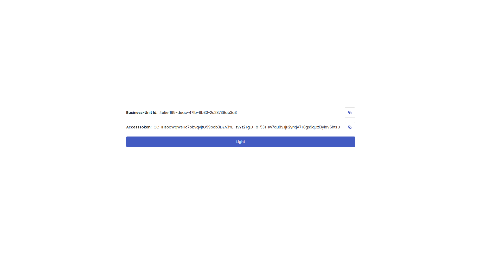
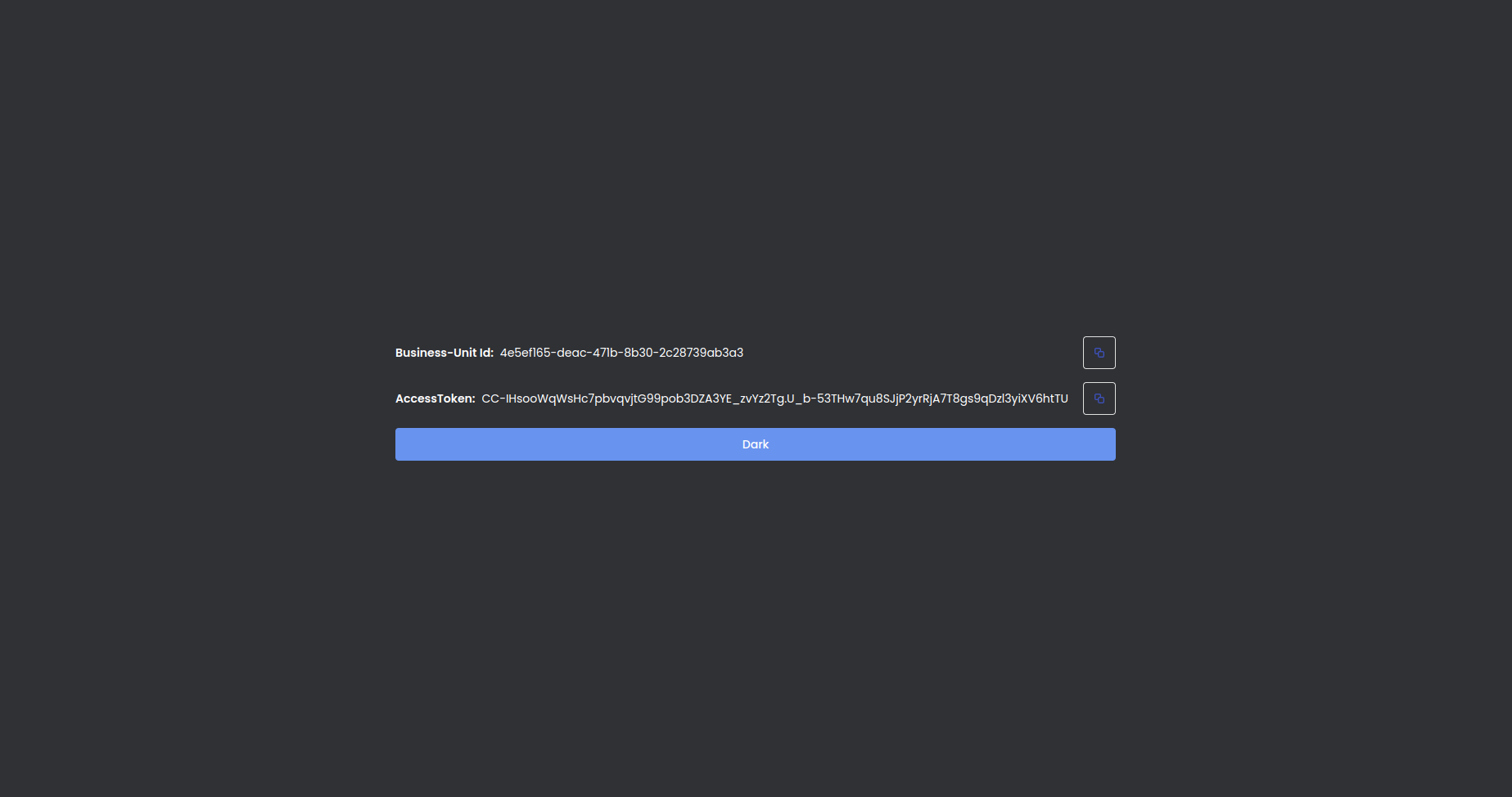
To validate theme switching, we create the theme toggle button to change the background color in
/admin.<script lang="ts">
.
.
function onClickToggleTheme() {
isDarkMode.set(!$isDarkMode);
}
.
.
</script>
.
.
<Button class="!w-full" on:click={onClickToggleTheme}>
{#if $isDarkMode} {$t(LocaleKeys.t_dark)} {:else} {$t(LocaleKeys.t_light)} {/if}
</Button>
.
.
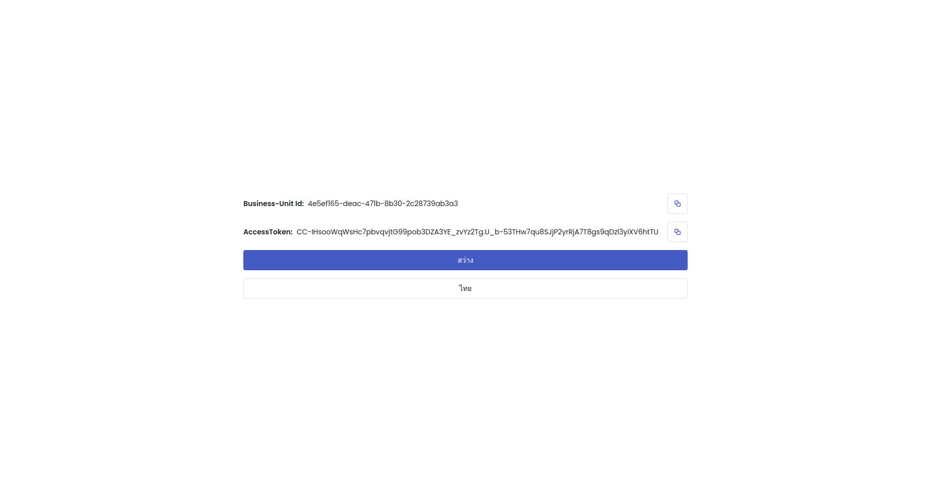
Add language switching
-
We are using sveltekit-i18n package for language switching.
In the starter project, there are 2 CSV files:
packages/shared/src/lib/translations/app/app_keys.csvto translate all texts in the app.packages/shared/src/lib/translations/app/app_keys.csvto translate all error messages in the app.
-
You can add your keys for translation by adding row in
app_keys.csvfiles."products","Products","สินค้า"
"light","Light","สว่าง"
"dark","Dark","มืด"
"th","TH","ไทย"
"en","EN","อังกฤษ" -
These CSV files will be used for generating to
en.jsonth.jsonerror_status_keys_gen.tslocale_keys_gen.ts
by running the following command:
make gen_translation -
Add the following
packages/shared/src/lib/translations/i18n.tsto configurate translation files path for svelte-i18nimport i18n from 'sveltekit-i18n'
const config = {
loaders: [
{
locale: 'en',
key: '',
loader: async () => (await import('./app/langs/en. json')).default,
},
{
locale: 'th',
key: '',
loader: async () => (await import('./app/langs/th. json')).default,
},
{
locale: 'en',
key: '',
loader: async () => (await import('./error/langs/en. json')).default,
},
{
locale: 'th',
key: '',
loader: async () => (await import('./error/langs/th. json')).default,
},
],
}
export const { t, locale, locales, loading, loadTranslations } = new i18n(
config
) -
You can implement language switching by adding init i18n functions inside the
LayoutLoadfunction of the+layout.ts.const defaultLocale = 'en'
const initLocale = locale.get() || defaultLocale
await loadTranslations(initLocale) -
To validate language switching, we create the language toggle button to change the language.
<script lang="ts">
   .
   .
  function onClickToggleLanguage() {
    if ($locale === "en") locale.set("th");
    else locale.set("en");
  }
  .
  .
</script>

 <Button
 class="!w-full"
 variant={ButtonVariants.secondaryOutline}
 on:click={onClickToggleLanguage}
 >
 {#if $locale === 'en'}
   {$t(LocaleKeys.t_en)}
 {:else}
   {$t(LocaleKeys.t_th)}
 {/if}
 </Button>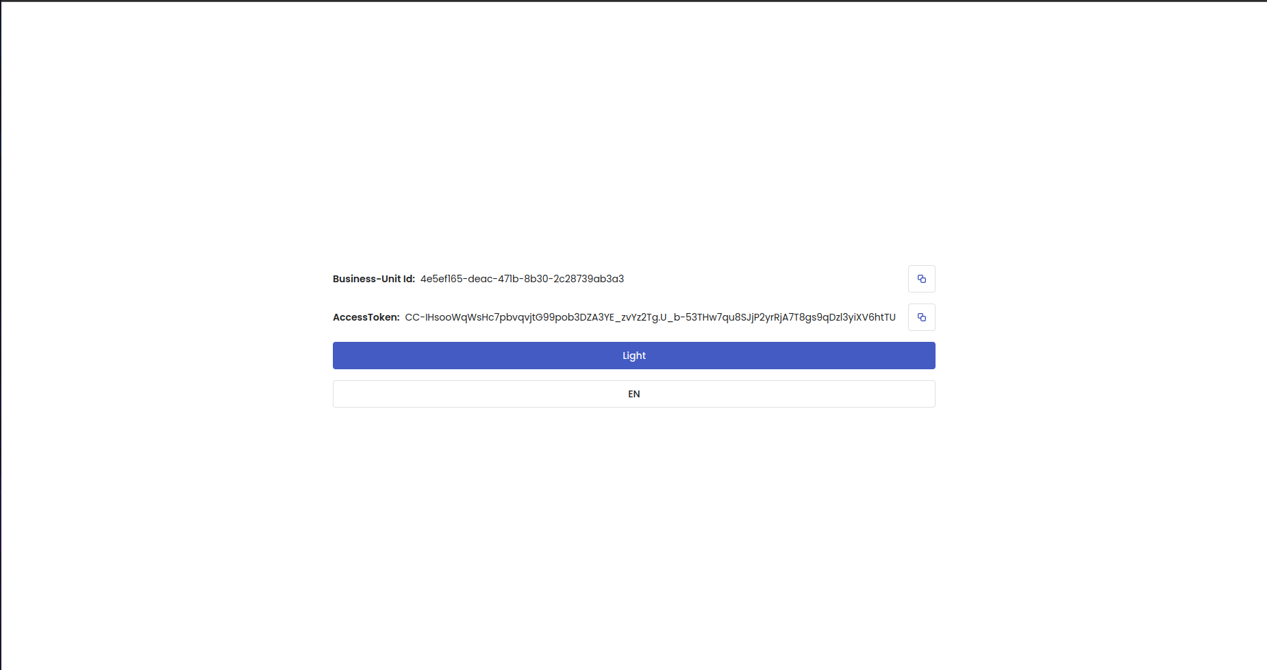
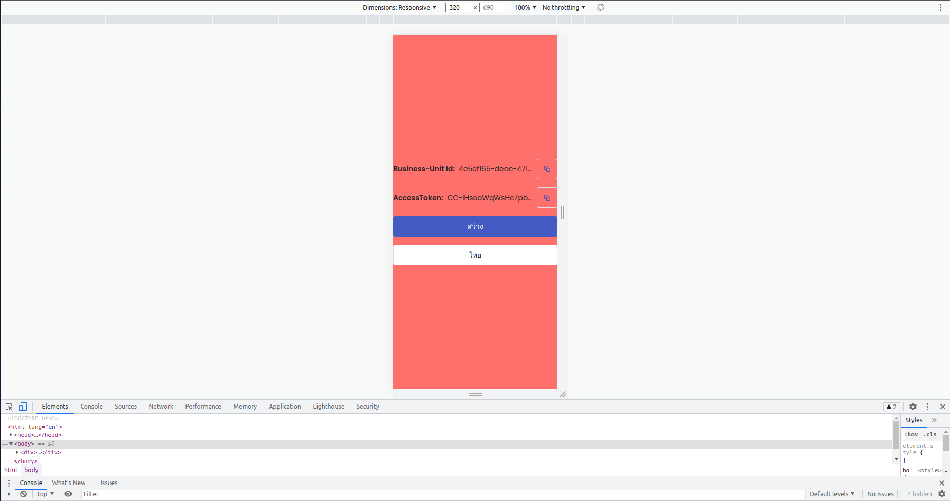
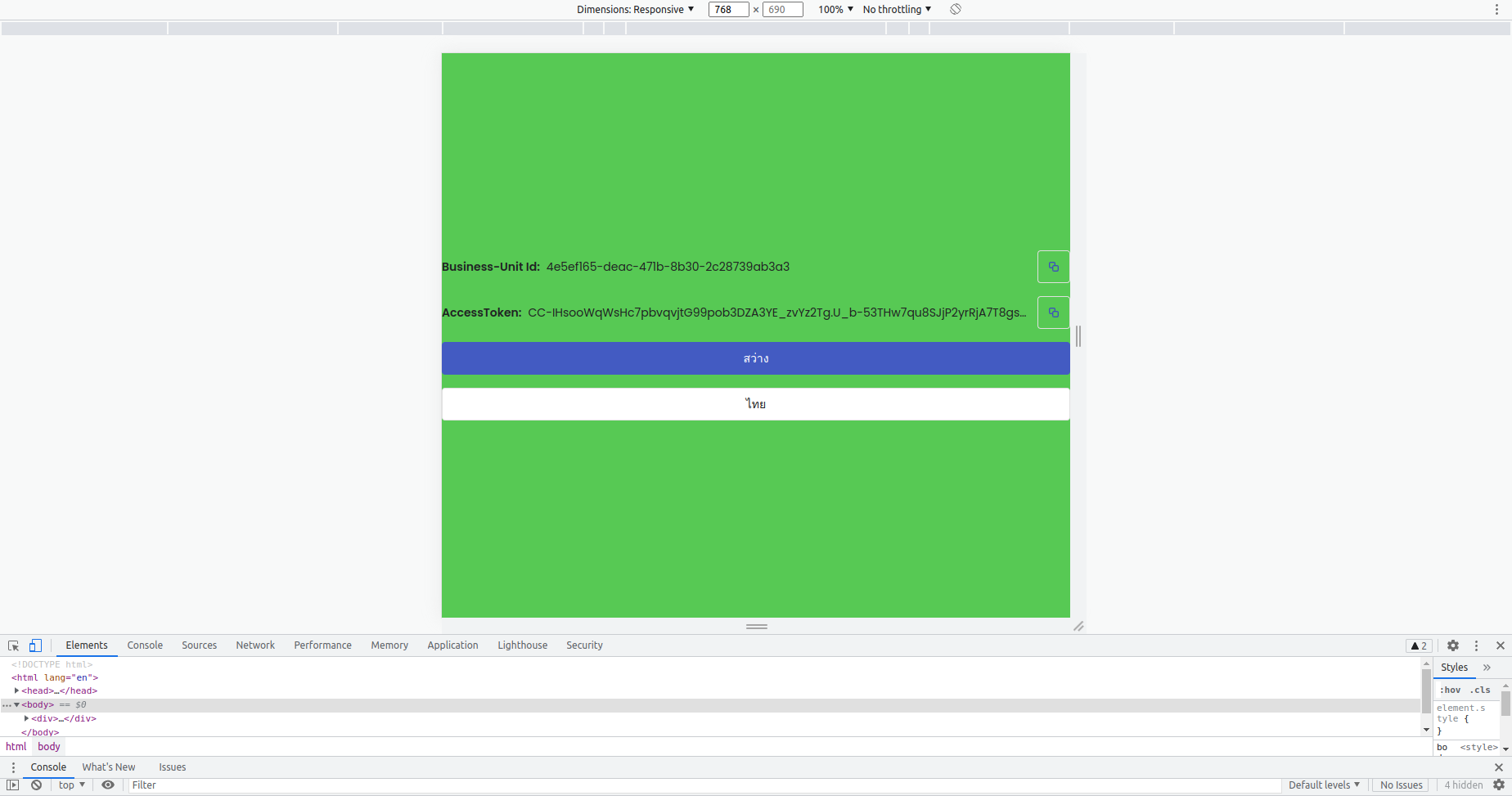
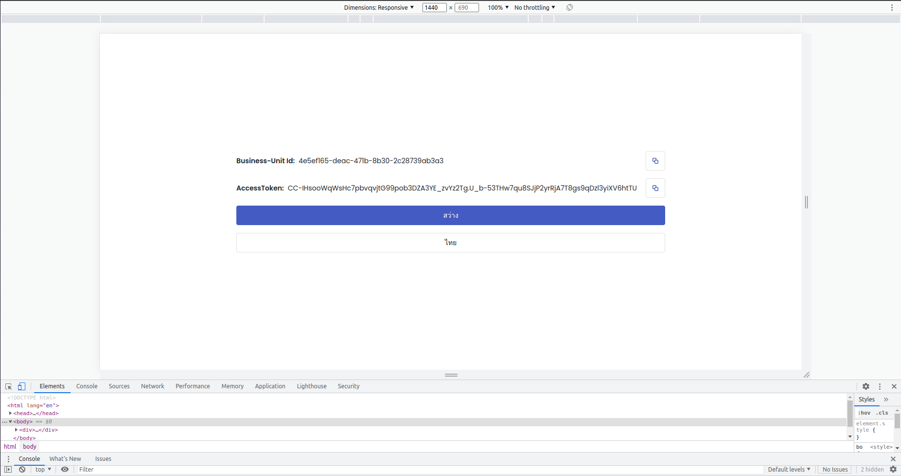
Add responsive layouts
In this tutorial, we will support 3 layouts consist of:
- mobile (width < 420px )
- tablet (420px < width < 960px)
- desktop (width > 960px)
By default, TailwindCSS uses a mobile-first breakpoint system. Use unprefixed utilities to target mobile, and override them at larger breakpoints. You can read more about how to config responsive design in TailwindCSS here.
-
You can look at a custom breakpoint in the
screensfield in thethemefield insidetailwind.config.cjs.screens: {
tablet: '420px',
desktop: '960px'
}, -
Change code in
/admin/product/+page.svelteto the following:<div
class="flex h-full w-full items-center justify-center bg-error tablet:bg-success desktop:bg-background"
>
. . .
</div> -
To validate responsive layouts, we will change the screen size to change the background.
Create and List products using GraphiQL
To call FoundationAdminAPI using GraphiQL, you can open your browser then go to FoundationAdminAPI URL at https://foundation-admin.naaraanhq.dev and follow this GraphiQL tutorial using Business-Unit Id and AccessToken from https://test.naaraan.dev/admin.
Query products in /admin/products page (SSR)
-
Create
/admin/productspage -
Create a
_gqlfolder with the following files in theproductsfolder to store all GraphQL functions on this page..
├── admin
│ └── products
│ ├── +page.svelte
│ ├── +page.ts
│ └── _gql
│ ├── foundation_admin.generated.ts
│ ├── foundation_admin.graphql
│ └── foundation_admin.ts -
Construct
productsquery in GraphiQL which has query fields as below- edges.node.id
- edges.node.title
- edges.node.isDisplayed
- edges.node.items.inventories.qtyAvailable
- userErrors.errorCode
- userErrors.message
- userErrors.field
and copy a
productsquery and paste it onfoundation_admin.graphql -
Run the following command to generate input types, response types and GQL document from
foundation_admin.graphqltofoundation_admin.generated.tscd /apps/storefront
make gen_gql_all -
Create
queryProductsfunction to init FoundationAdmin GraphQL client, call API and handle error infoundation_admin.tsNote: You can use the VSCode snippet as a shortcut for creating this function by typing these keywords
gqlqfor GraphQL query andgqlmfor GraphQL mutation.import {
ProductConnection,
ProductSortKey,
} from '$shared_lib/data/graphql/model/foundation_admin'
import { createFoundationAdminClient } from '$shared_lib/data/sources/client_foundation_admin'
import {
handlingCombinedError,
handlingGenericeError,
handlingUserErrorGen,
} from '$shared_lib/utils/error'
import { ProductsDocument } from './foundation_admin.generated'
export async function queryProducts(args: {
fetch?: any
businessUnitId?: string
accessToken?: string
first?: number
last?: number
before?: string
after?: string
sort?: ProductSortKey
query?: string
}): Promise<ProductConnection> {
let data: ProductConnection = <ProductConnection>{}
const client = createFoundationAdminClient({
fetch: args.fetch,
accessToken: args.accessToken,
businessUnitId: args.businessUnitId,
})
await client
.query(ProductsDocument, {
first: args.first,
last: args.last,
before: args.before,
after: args.after,
sort: args.sort,
query: args.query,
})
.toPromise()
.then((result) => {
if (result.data) {
if ((result.data.products.userErrors ?? []).length != 0) {
handlingUserErrorGen(result.data.products.userErrors)
}
data = result.data.products as ProductConnection
if (result.error) {
handlingCombinedError(result.error)
}
}
})
.catch(function (error: any) {
handlingGenericeError()
})
return data
} -
Call
queryProductsin+page.tsto query the list of products in SSR and pass the error and the productConnection to the page.import { ProductConnection } from '$shared_lib/data/models/graphqlfoundation_admin';
import { AppError } from '$shared_lib/utils/error';
import type { PageLoad } from './$types';
import { queryProducts } from './\_gql/foundation_admin';
export const load: PageLoad = async ({ fetch, parent }) => {
let error: AppError | undefined;
let productConnection: ProductConnection | undefined;
// wait until LayoutLoad in +layout.ts has finished
// to get accessToken and businessUnitId from parentData
const parentData = await parent();
try {
productConnection = await queryProducts({
// Don't forget to parse fetch function from PageLoad in SSR.
// If not parse fetch function here, your products will be
// fetched in CSR instead.
fetch: fetch,
accessToken: parentData?.accessToken,
businessUnitId: parentData?.app?.businessUnitId
});
} catch (e) {
if (e instanceof AppError) {
error = e;
}
}
return {
error: error,
productConnection: productConnection
};
}; -
Add error handling and display product data in
+page.svelte.<script lang="ts">
import { addToast, ToastVariants } from '$shared_lib/components/toast/toast';
import { toastRemoveDuration } from '$shared_lib/constants/app_constants';
import { t } from '$shared_lib/translations/i18n';
import { AppError } from '$shared_lib/utils/error';
import type { PageData } from './$types';
export let data: PageData;
let error: AppError | undefined = data.error;
// show ErrorToast when has some errors
$: if (error) {
addToast($t(error.errorCode), toastRemoveDuration, ToastVariants.error);
}
</script>
{#if data?.productConnection?.edges}
{#each data?.productConnection?.edges as productEdge}
<h2>{productEdge.node.title}</h2>
{/each}
{/if} -
Validate your SSR products query result by opening the
Networktab in Developer tools.- If your
productsdocument has data in thepreviewtab like the first picture that means data has been fetched in SSR. - If there is no any products data like the second picture that means your data has been fetched in CSR (Maybe forgot to parse fetch from PageLoad to queryProducts).
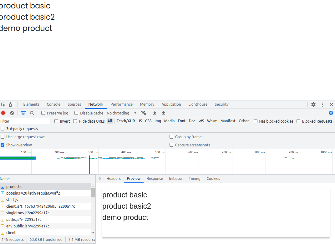
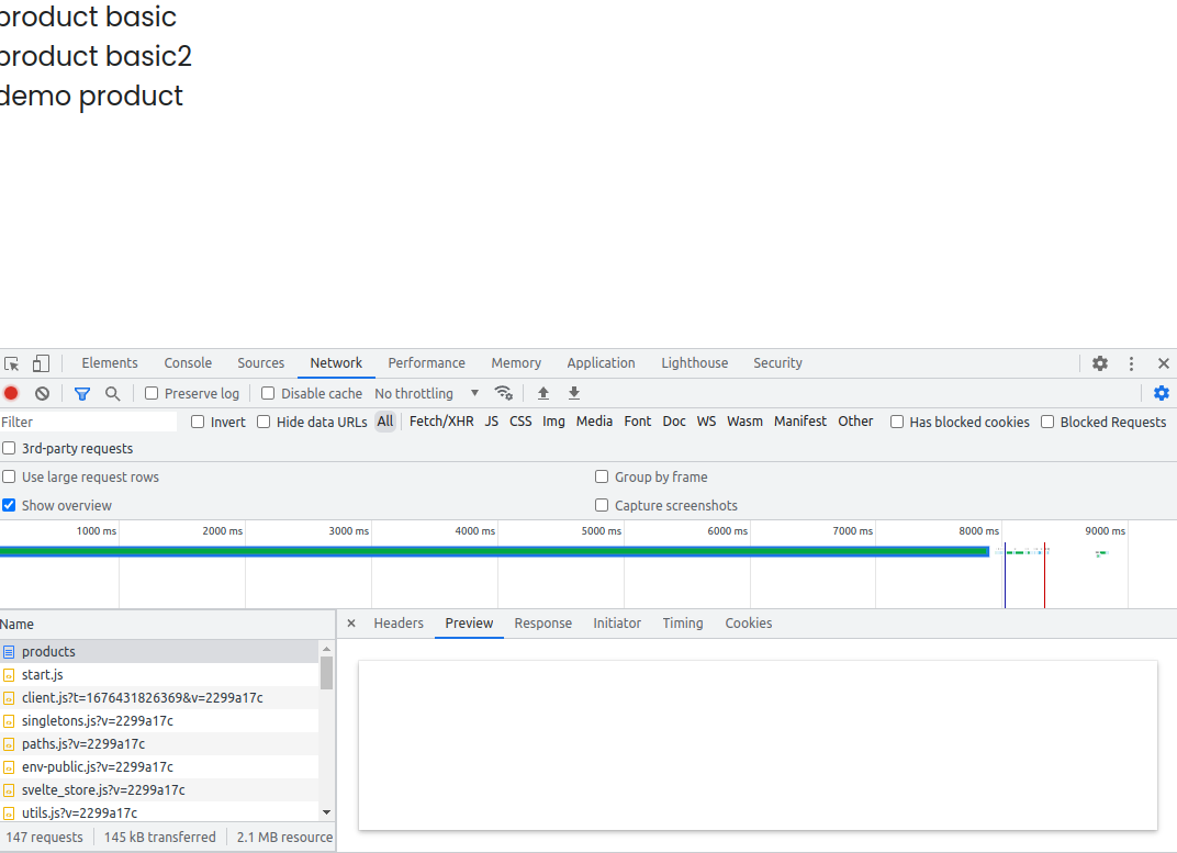
- If your
Create a product in /admin/products/[product_id] page
-
Create
[product_id]folder nested below theproductsfolder and add_gqlfolder like steps 1 and 2 in the last section..
├── admin
│ └── products
│ ├── +page.svelte
│ ├── +page.ts
│ ├── _gql
│ └── [product_id]
│ ├── +page.svelte
│ ├── +page.ts
│ └── _gql
│ ├── foundation_admin.generated.ts
│ ├── foundation_admin.graphql
│ └── foundation_admin.ts -
Create
productMutationin GraphiQL and paste onfoundation_admin.graphqlthen runcd /apps/storefront
make gen_gql_all -
Create
mutationProductCreatefunction infoundation_admin.tsexport async function mutationProductCreate(args: {
accessToken?: string;
businessUnitId?: string;
input: ProductInput;
}): Promise<ProductResult> {
let data: ProductResult = <ProductResult>{};
const client = createFoundationAdminClient({
accessToken: args.accessToken,
businessUnitId: args.businessUnitId
});
await client
.mutation(ProductCreateDocument, { input: args.input })
.toPromise()
.then((result) => {
if (result.data) {
if ((result.data.productCreate.userErrors ?? []).length != 0) {
handlingUserErrorGen(result.data.productCreate.userErrors);
}
data = result.data.productCreate as ProductResult;
if (result.error) {
handlingCombinedError(result.error);
}
}
})
.catch(function (error: any) {
handlingGenericeError();
});
return data;
} -
Add the below code to
/products/[product_id]/+page.sveltethen try to create a new product.<script lang="ts">
import { goto } from '$app/navigation';
import { Button } from '$shared_lib/components/buttons/button';
import { addToast, ToastVariants } from '$shared_lib/components/ toast/toast';
import { toastRemoveDuration } from '$shared_lib/constants/ app_constants';
import { ItemClass, ProductInput } from '$shared_lib/data/models/ graphql/foundation_admin';
import { session } from '$shared_lib/stores/session';
import LocaleKeys from '$shared_lib/translations/generated/ locale_keys_gen';
import { t } from '$shared_lib/translations/i18n';
import { AppError } from '$shared_lib/utils/error';
import type { PageData } from './$types';
import { mutationProductCreate } from './_gql/ foundation_admin';
import { v4 as uuidv4 } from 'uuid';
export let data: PageData;
let error: AppError | undefined = data.error;
let newProductInput: ProductInput = {
title: 'new product ' + uuidv4(),
items: [
{
title: 'new product ' + uuidv4(),
itemClass: ItemClass.Sales,
inventories: [
{
qtyAvailable: 10
}
],
prices: [
{
priceAmount: '100'
}
]
}
]
};
async function productCreate(productInput: ProductInput) {
try {
let productResult = await mutationProductCreate({
businessUnitId: $session?.app?.businessUnitId,
accessToken: $session?.accessToken,
input: productInput
});
if (productResult) {
goto('/admin/products');
}
} catch (e) {
if (e instanceof AppError) {
error = e;
}
}
}
// show ErrorToast when has some errors
$: if (error) {
addToast($t(error.errorCode), toastRemoveDuration, ToastVariants.error);
}
</script>
<div class="h-full flex flex-col gap-4 items-cente justify-center">
<pre>{JSON.stringify(newProductInput, null, 2)}</pre>
<Button on:click={() => productCreate(newProductInput)}>
{$t(LocaleKeys.t_create)}
</Button>
</div>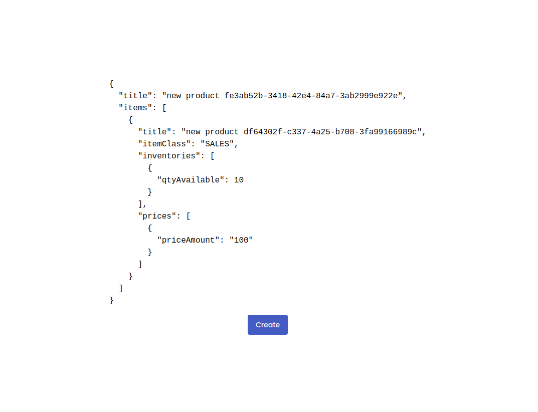
-
If your product has been successfully created, it should be listed on
/productspage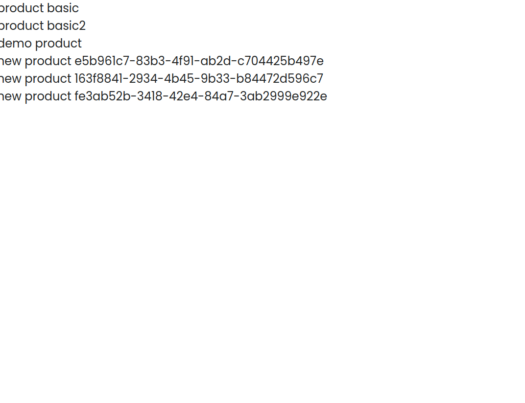
Assignment
After we have learned all the base parts of this project, your task is to build the rest of this app from this design sveltekit-products design by using the following FoundationAdminAPI that you can search for these API documents in GraphiQL:
Query
- product: to fetch product by id
Mutation
- productUpdate: to update an existing product must send updated product information with the id
- productDelete: to delete an existing product by id